Colorful Neutrals In Interior Design
CONTACT US
At Lola Tucker Interiors, we love finding ways to stretch the limits of traditional design. One concept we often use is the idea of “colorful neutrals”—fabrics, rugs, or even wallpaper that incorporate multiple colors while still acting as a versatile foundation. They add depth and character, but in a way that’s subtle, never overwhelming. It’s a smart way to bring color into a room without committing to bold, high-contrast shades.
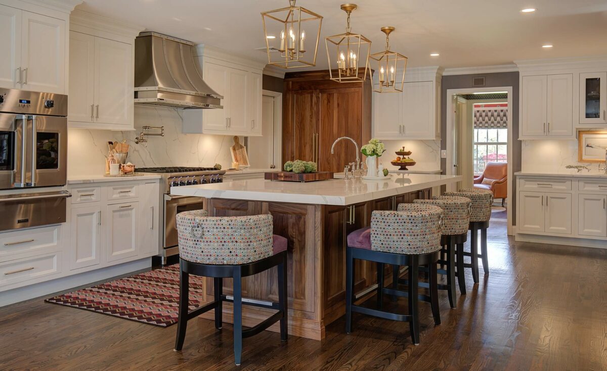
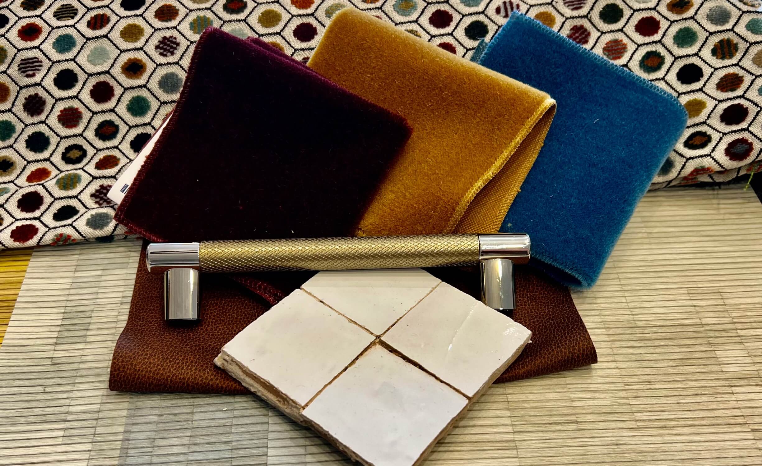
A colorful neutral is all about balance. It offers the flexibility of a neutral, with just enough vibrancy to create interest. Take Osborne and Little’s Pelangi Velvet, for example. This fabric brings together a mix of burgundy, teal, and earthy tones, all within a geometric honeycomb pattern. The result? A design that feels full of life but can still blend seamlessly with other elements in the room.
When using a colorful neutral, it’s fun to experiment with pairing it alongside bold accents. Deep, rich paint colors like Benjamin Moore’s Essex Green or Hale Navy can really draw out the fabric’s tones and give the room a sophisticated feel. But for a softer, more relaxed vibe, you might choose accents in shades like Mossy Green or Prescot. These colors complement the fabric’s textures without competing for attention.
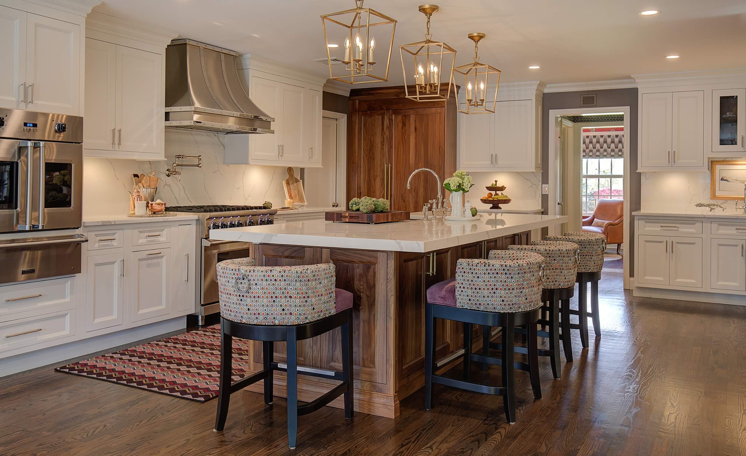
What’s particularly wonderful about colorful neutrals is how easily they fit into different spaces. They add visual interest to a room without overpowering it. You could upholster a large piece like a sofa or accent chair in your colorful neutral, making it a subtle focal point. Or, use it more sparingly, like in throw pillows or drapery, to quietly tie a room together.
In transitional spaces like hallways or open floor plans, colorful neutrals can serve as a bridge, effortlessly connecting different rooms and color schemes. Their multi-tonal nature helps create a sense of flow, making them ideal for spaces where one area leads into another.
If you prefer a monochromatic palette but don’t want the space to feel too flat, colorful neutrals can also be your secret weapon. They bring in just enough variation to add character, while still maintaining a clean, polished look. Imagine a richly textured throw draped over a neutral sofa or cushions in varied hues that enhance a simple, monochrome room without overwhelming it.
In modern design, we often see a pull between minimalism and making bold statements. Colorful neutrals offer the best of both worlds—they’re versatile enough to act as a subtle backdrop but still have enough personality to stand out. Layering tones and textures this way creates a room that feels dynamic, personal, and thoughtfully curated.
At Lola Tucker Interiors, we see colorful neutrals as a perfect way to introduce depth and vibrancy while keeping the design flexible. Whether you’re designing a laid-back family space or a more serene retreat, colorful neutrals offer the perfect foundation for a room that evolves as your style changes.
So, next time you’re thinking of refreshing a room, consider adding a colorful neutral into the mix. It might not be the loudest piece in the room, but it will bring a sense of richness and balance that you’ll love for years to come.
Colorful Neutrals In Interior Design
CONTACT US
At Lola Tucker Interiors, we love finding ways to stretch the limits of traditional design. One concept we often use is the idea of “colorful neutrals”—fabrics, rugs, or even wallpaper that incorporate multiple colors while still acting as a versatile foundation. They add depth and character, but in a way that’s subtle, never overwhelming. It’s a smart way to bring color into a room without committing to bold, high-contrast shades.
A colorful neutral is all about balance. It offers the flexibility of a neutral, with just enough vibrancy to create interest. Take Osborne and Little’s Pelangi Velvet, for example. This fabric brings together a mix of burgundy, teal, and earthy tones, all within a geometric honeycomb pattern. The result? A design that feels full of life but can still blend seamlessly with other elements in the room.
When using a colorful neutral, it’s fun to experiment with pairing it alongside bold accents. Deep, rich paint colors like Benjamin Moore’s Essex Green or Hale Navy can really draw out the fabric’s tones and give the room a sophisticated feel. But for a softer, more relaxed vibe, you might choose accents in shades like Mossy Green or Prescot. These colors complement the fabric’s textures without competing for attention.

What’s particularly wonderful about colorful neutrals is how easily they fit into different spaces. They add visual interest to a room without overpowering it. You could upholster a large piece like a sofa or accent chair in your colorful neutral, making it a subtle focal point. Or, use it more sparingly, like in throw pillows or drapery, to quietly tie a room together.
In transitional spaces like hallways or open floor plans, colorful neutrals can serve as a bridge, effortlessly connecting different rooms and color schemes. Their multi-tonal nature helps create a sense of flow, making them ideal for spaces where one area leads into another.
If you prefer a monochromatic palette but don’t want the space to feel too flat, colorful neutrals can also be your secret weapon. They bring in just enough variation to add character, while still maintaining a clean, polished look. Imagine a richly textured throw draped over a neutral sofa or cushions in varied hues that enhance a simple, monochrome room without overwhelming it.

In modern design, we often see a pull between minimalism and making bold statements. Colorful neutrals offer the best of both worlds—they’re versatile enough to act as a subtle backdrop but still have enough personality to stand out. Layering tones and textures this way creates a room that feels dynamic, personal, and thoughtfully curated.
At Lola Tucker Interiors, we see colorful neutrals as a perfect way to introduce depth and vibrancy while keeping the design flexible. Whether you’re designing a laid-back family space or a more serene retreat, colorful neutrals offer the perfect foundation for a room that evolves as your style changes.
So, next time you’re thinking of refreshing a room, consider adding a colorful neutral into the mix. It might not be the loudest piece in the room, but it will bring a sense of richness and balance that you’ll love for years to come.
Colorful Neutrals In Interior Design
At Lola Tucker Interiors, we love finding ways to stretch the limits of traditional design. One concept we often use is the idea of “colorful neutrals”—fabrics, rugs, or even wallpaper that incorporate multiple colors while still acting as a versatile foundation. They add depth and character, but in a way that’s subtle, never overwhelming. It’s a smart way to bring color into a room without committing to bold, high-contrast shades.
A colorful neutral is all about balance. It offers the flexibility of a neutral, with just enough vibrancy to create interest. Take Osborne and Little’s Pelangi Velvet, for example. This fabric brings together a mix of burgundy, teal, and earthy tones, all within a geometric honeycomb pattern. The result? A design that feels full of life but can still blend seamlessly with other elements in the room.
When using a colorful neutral, it’s fun to experiment with pairing it alongside bold accents. Deep, rich paint colors like Benjamin Moore’s Essex Green or Hale Navy can really draw out the fabric’s tones and give the room a sophisticated feel. But for a softer, more relaxed vibe, you might choose accents in shades like Mossy Green or Prescot. These colors complement the fabric’s textures without competing for attention.

What’s particularly wonderful about colorful neutrals is how easily they fit into different spaces. They add visual interest to a room without overpowering it. You could upholster a large piece like a sofa or accent chair in your colorful neutral, making it a subtle focal point. Or, use it more sparingly, like in throw pillows or drapery, to quietly tie a room together.
In transitional spaces like hallways or open floor plans, colorful neutrals can serve as a bridge, effortlessly connecting different rooms and color schemes. Their multi-tonal nature helps create a sense of flow, making them ideal for spaces where one area leads into another.
If you prefer a monochromatic palette but don’t want the space to feel too flat, colorful neutrals can also be your secret weapon. They bring in just enough variation to add character, while still maintaining a clean, polished look. Imagine a richly textured throw draped over a neutral sofa or cushions in varied hues that enhance a simple, monochrome room without overwhelming it.

In modern design, we often see a pull between minimalism and making bold statements. Colorful neutrals offer the best of both worlds—they’re versatile enough to act as a subtle backdrop but still have enough personality to stand out. Layering tones and textures this way creates a room that feels dynamic, personal, and thoughtfully curated.
At Lola Tucker Interiors, we see colorful neutrals as a perfect way to introduce depth and vibrancy while keeping the design flexible. Whether you’re designing a laid-back family space or a more serene retreat, colorful neutrals offer the perfect foundation for a room that evolves as your style changes.
So, next time you’re thinking of refreshing a room, consider adding a colorful neutral into the mix. It might not be the loudest piece in the room, but it will bring a sense of richness and balance that you’ll love for years to come.
Colorful Neutrals In Interior Design
At Lola Tucker Interiors, we love finding ways to stretch the limits of traditional design. One concept we often use is the idea of “colorful neutrals”—fabrics, rugs, or even wallpaper that incorporate multiple colors while still acting as a versatile foundation. They add depth and character, but in a way that’s subtle, never overwhelming. It’s a smart way to bring color into a room without committing to bold, high-contrast shades.
A colorful neutral is all about balance. It offers the flexibility of a neutral, with just enough vibrancy to create interest. Take Osborne and Little’s Pelangi Velvet, for example. This fabric brings together a mix of burgundy, teal, and earthy tones, all within a geometric honeycomb pattern. The result? A design that feels full of life but can still blend seamlessly with other elements in the room.
When using a colorful neutral, it’s fun to experiment with pairing it alongside bold accents. Deep, rich paint colors like Benjamin Moore’s Essex Green or Hale Navy can really draw out the fabric’s tones and give the room a sophisticated feel. But for a softer, more relaxed vibe, you might choose accents in shades like Mossy Green or Prescot. These colors complement the fabric’s textures without competing for attention.

What’s particularly wonderful about colorful neutrals is how easily they fit into different spaces. They add visual interest to a room without overpowering it. You could upholster a large piece like a sofa or accent chair in your colorful neutral, making it a subtle focal point. Or, use it more sparingly, like in throw pillows or drapery, to quietly tie a room together.
In transitional spaces like hallways or open floor plans, colorful neutrals can serve as a bridge, effortlessly connecting different rooms and color schemes. Their multi-tonal nature helps create a sense of flow, making them ideal for spaces where one area leads into another.
If you prefer a monochromatic palette but don’t want the space to feel too flat, colorful neutrals can also be your secret weapon. They bring in just enough variation to add character, while still maintaining a clean, polished look. Imagine a richly textured throw draped over a neutral sofa or cushions in varied hues that enhance a simple, monochrome room without overwhelming it.

Of course, there’s an art to picking the best items. We approach antiquing with an open mind but a clear vision. We inspect each piece carefully—checking for quality, asking about the item’s history, and imagining how it could fit into the broader design. A little wear is part of the charm, but we want to ensure that the piece is in good condition and that it can withstand the demands of everyday use.
And let’s not forget the art of negotiation. Haggling is an essential part of the antiquing experience, and while it can be tricky, we’ve learned to approach it with a combination of knowledge and politeness. Knowing the value of what you’re purchasing gives you confidence in the negotiation, and a friendly, respectful demeanor often leads to better results. We find that bundling items can help too—if you’re purchasing a few pieces, sellers are usually more willing to offer a discount.
Right now, we’re particularly excited about incorporating these finds into the projects we’re working on in Manhattan, The Hamptons, and throughout the Tri-state area. Each project has its own personality, and the antiques we’re sourcing play a huge role in making these spaces feel more curated and personal. We’ve been on the lookout for statement pieces like antique dining tables, hand-knotted rugs, and distinctive lighting, but we’re also drawn to the smaller touches—vintage vases, candlesticks, and even old books—that can add character and warmth to a room. These pieces, when mixed with contemporary designs, create that perfect balance of old and new.
Antiques truly belong in every home, regardless of style. Whether you’re a seasoned collector or just starting to dip your toe into the world of antiquing, we think there’s always room for a piece with history. It adds dimension and a sense of narrative to a space that’s impossible to recreate with mass-produced items.
At Lola Tucker Interiors, we love nothing more than helping our clients find those special items that make their homes feel unique, layered, and timeless. As we continue our antiquing journey this fall, we’re excited to bring more treasures into our designs and, in turn, into your homes.


